
Big Data & Analytics Video
In today’s economy, data is everything. But raw data is just noise. The real value lies in the insights, the hidden trends and actionable patterns that help businesses make smarter decisions. This is the world of data analytics, and explaining its value requires turning the abstract into something concrete.
How do you show the power of a predictive analytics platform or the clarity of a business intelligence dashboard? How do you tell a compelling story using numbers? The most effective way is through dynamic data visualization and motion graphics.
Telling the Story Behind the Numbers
A data analytics explainer video is uniquely capable of bringing data to life. While static charts and graphs can show a snapshot in time, animation can show the process. It can visualize data flowing from multiple sources, being cleaned and transformed, and finally revealing a crucial insight that was previously hidden.
A great video in this space doesn’t just present data; it builds a narrative around it. It focuses on the “so what?” connecting the analytics directly to better business outcomes, like optimized supply chains, personalized customer experiences, or new market opportunities.
A Showcase of Data-Driven Storytelling
In the collection below, we’ve gathered exceptional video examples from the big data and analytics industry. Pay attention to how these brands use motion graphics video examples to make charts, graphs, and dashboards feel dynamic and engaging. Notice how they transform complex data streams into simple, powerful stories of insight and action.
Use this showcase as your video inspiration for making your own data platform clear, compelling, and indispensable.


Motion Graphics Video Example: How Contentsquare Reveals What Customers Really Want

Brand Video Example: How Snowflake Tells the Story Behind Its Founding Team

Strategic Business | Live Action Brand Film | Amazon Business

Material Design Tools | 2D Animation | Explainer | Google Design

Enhanced Volvo FMX Ground Clearance | Brand Film | Volvo Trucks

Wireless Spectrum & 5G | 2D Animation | Brand Film | CTIA

Square Data Transformation | Customer Stories | Amplitude
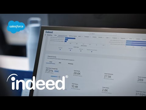
Data Decisions at Indeed | Customer Stories | Salesforce

Managing Rapid Data Growth | Customer Stories | IBM Technology

Eclipse Megamovie | Explainer & Promotional Video | Google

Survey Analysis Techniques | 2D Animation | SurveyMonkey

Maximize eCommerce Success | Live Action | Explainer | Wix

Optimize Your Wi-Fi: Bandwidth Hogs | 3D Animation | ARRIS

Project Lighthouse | 2D Animation | Explainer | Airbnb

Safe and | Live Action Motion Graphics | Explainer Video | Uber

Brand Metrics | 2D Animation | Explainer Video | SurveyMonkey

Digital Engagement & | Motion Graphics | Brand film | Vidmob

Transform Your Data Skills | Motion Graphics | DataCamp

Industry Trends & | 2D Animation Explainer | SurveyMonkey