Last Updated on March 5, 2026
Contents
Marketing Message
Freshdesk (now known as Freshworks) was born as a response to a comment on a news item about how a leading customer support software company hiked prices up to 300% and made their customers unhappy. Since then, it has come a long way. Freshdesk, through this explainer video, wanted bring out how difficult it was to be a customer support executive/manager in the current times. They had to face immense challenges in the form of social media. This was a challenge that could be met easily with Freshdesk . Other features and benefits of Freshdesk— especially the fact that it was a way more economical option— had to be conveyed too.
How we approached it
We usually prefer humorous approach to our explainer videos. Everybody loves something that makes you smile. So, if the demo video makes your viewers smile, then they’re going to develop a liking for your product too. Thankfully for us, Girish Mathrubootham, the founder and CEO of Freshdesk,(now known as Freshworks), gave us a free rein over creativity. And we made the best possible use of it. Keeping the marketing message in mind, we devised a script revolving around the plight of a Customer Service in-charge. He had to track all the phones, emails etc and also take flak in the form of social media. The entire script was from his perspective and had a lot of humor woven around his frustration. The tone of the explainer video changed only when Freshdesk was introduced and we had to get into the serious business of explaining what it did. But we did bring in a touch of humor right at the end, to ensure that the viewer completed seeing the explainer video with a pleasant feeling.
Style
Since we had already decided on a humorous style, the rest followed easily. We wanted a realistic look and feel, but wanted to exaggerate the expressions and problems to catch attention and sustain humor. As a lot had to be explained in a short time, and also because we wanted viewers to remain engaged, we knew we would have to use fast animation in our explainer video.
Colors
Freshdesk had a newly designed website in place and we had to incorporate the colors and theme into our video.Since the Freshdesk (now known as Freshworks) homepage had vibrant colors, we used pale yellow and blue, to make the video stand out. To depict the pain points via colors, we used black and red. Once Freshdesk was introduced, we used colors very similar to what were found in the homepage— to extend the branding.
Characters
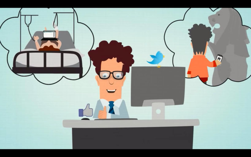
We had one main character- the Customer support manager. We wanted him to look like a real human being and so we modeled him to be a mix of a geek and an executive. He had to look harassed and lovable at the same— and I think we managed that pretty well. The other “characters” were not so much characters in what they were, but they became characters because of the role they had to play in the video. And these were the Twitter “bird” symbol and the Facebook “like” symbol— both of which came to life in our video- lending it a lot of originality. We had a few minor characters— the agents and customers, who did not have to get established too much and to keep up with the theme of the explainer video, we modeled them to resemble the main character.

Visualization
We usually use 2D animation, as this does not give that “realistic” look, we decided to go with 2D-3D hybrid. We gave the characters and assets shadows to make the 2D objects look like 3D. We decided to comically exaggerate the pain points with visuals. We knew some scenes were going to be “wow” scenes when animated. The scene where the character gets lost in a mountain of emails was one such scene. It needed a lot of planning. The tornado scene in which the character gets caught and swept away would be another challenge, but we visualized it because we knew it would be something that stayed with the viewer. We introduced visual humor in many other places too. The Facebook hand would punch the character while twitter bird fluttered around his head. The same bird would carry a negative comment that’d end up becoming a tornado. The eyes of the Customer support guy would pop out when he found out how costly the solutions were. He would lose all hope and this could be shown by introducing a noose— exaggerated comedy again. We planned to “showcase” the explanation part and not make it look mundane and boring. Another thing we planned in visualization was to use limited assets but raise the bar on the explainer video quality. We were driven by the motto “Keep it simple“
Animation
At the visualization stage we went with “Keep it simple” to send across the message in the least complicated manner. But because of this animation itself was not so simple. It had to be of a quality not seen in regular demo videos. So goodbye stick figures and unrealistic-looking tornadoes- we were taking things a notch higher. Many demo videos have scene with piled-up letters and tornadoes but we wanted to make this special. The same was the case with the characters and the entire “feel” of the video- it had to stand out. This was why we decided to go with a 2D-3D hybrid. Using After Effects and Cinema 4D softwares we managed to create a distinct style. For precise transition, “Expressions” and “Graph Editor” were used— this eased the transitions and brought out the natural dynamics.
To make an explainer video success, sound plays a major role. We had a great, expressive Voice over in place, so that helped design the explainer video. But it needed good sound designing— like the final garnishing on it. We used two types of music, one dramatic, foreboding and melancholy in the beginning —and the other upbeat, peppy and feel-good after the introduction of Freshdesk . Subtle Sound effects had to be added, like when the emails fell, phone rang, the man got hit or he threw down the computer etc. Careful attention had to be paid to this part— too much and the video could get irritating and too little and the video would become a drag—so sound designing had to be just right.
After meticulous planning and execution in each stage, the Freshdesk explainer video got the merit it deserves. It became very popular and continues to draw admirers to it every day!
Team Involved
Animations : Saravanan and Dinesh
Script : Vimida
Creative Direction : Udhayakrishna
Video in Press
Tech Crunch | Killerstartups.com
Want a cool explainer video? You can get in touch with us here
Let us know if you need a video, we are here to help.

