Last Updated on May 20, 2026
Contents
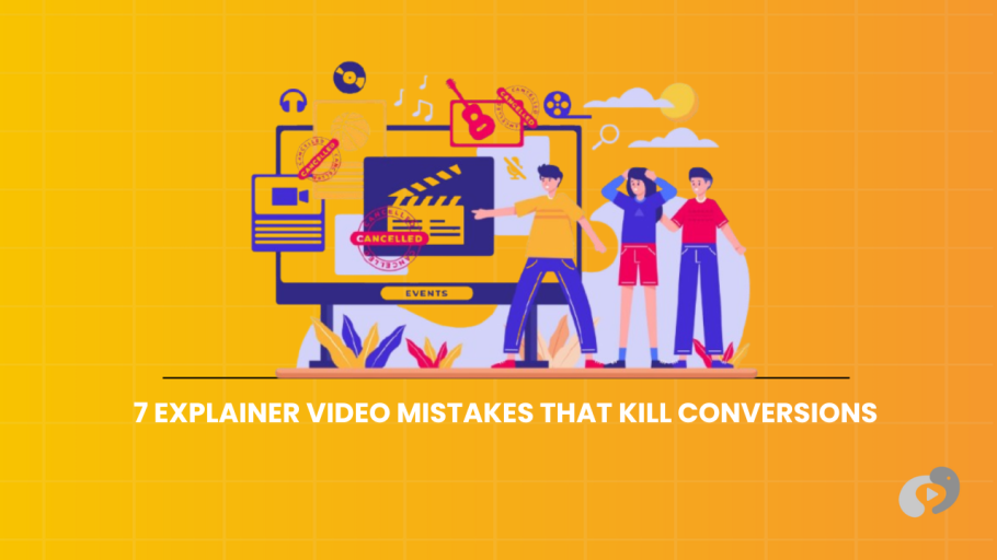
There is a very specific feeling of disappointment I get when I audit a B2B website. I land on the homepage and see a play button. Naturally, I click it hoping to understand the product. However, ninety seconds later, I am more confused than when I started. This is the result of avoidable explainer video mistakes.
Unfortunately, it happens all the time. Companies spend months of time and thousands of dollars on a video project only to have it flop. Consequently, they get zero leads. The view count stalls at 300, and usually, 200 of those are their own employees.
The Cost of Failure
It is not just the wasted production budget that hurts. More importantly, it is the opportunity cost. Every prospect who watches a bad video and bounces is a potential deal lost.
Why Do These Explainer Video Mistakes Happen?
Usually, it is not because the animation was bad. Rather, it is because the strategy was flawed. They treated the video like a piece of art instead of a piece of sales collateral.
The Turnaround
The good news is that most of these explainer video mistakes are fixable. Sometimes you just need to re-cut the intro. Alternatively, sometimes you just need to change the voiceover.
TL;DR: The “Do Not Do This” List
- The “Feature Dump”: Listing every single thing your software does. It bores people. Instead, focus on the one big problem you solve.
- The “Slow Roll” Intro: Spending the first twenty seconds on your logo and company history. You need to hook the viewer in the first three seconds or they are gone.
- The Audio Afterthought: Using cheap stock music or robotic AI voiceovers. Bad audio ruins good visuals every time.
- The Weak Ask: Ending the video with a vague “Learn More.” You need to tell them exactly what to do next, like “Book a Demo.”
- The Style Mismatch: Using a playful cartoon style for a serious enterprise security product. It kills trust instantly.
- The “One Size” Duration: Making a three-minute video for a cold social media ad. It is too long. Context matters.
- The “Set It and Forget It”: Uploading the video to YouTube and hoping it goes viral. It won’t. You need a distribution plan.
Mistake 1: The “Kitchen Sink” Script
This is the most common error I see in B2B. You are proud of your product. Furthermore, you spent three years building it. Finally, you want to tell the world about the API integrations, the security compliance, the dark mode, and the new reporting dashboard.
So you put it all in the script.
The Result: Information Overload.
The viewer’s brain shuts down. They cannot process that much information in sixty seconds. Consequently, they stop listening and just watch the pretty colors until the video ends. Then they leave.
The Fix: The “Rule of One”
As we discussed in our Scriptwriting Guide, you need to be ruthless to avoid explainer video mistakes like this.
- Pick one major pain point.
- Pick one major solution.
- Pick one call to action.
If you have other features you want to show off, that is great. However, put them in a separate video. Or put them in the demo call. The job of the explainer video is not to close the deal; rather, the job is to get them interested enough to take the next step.
Mistake 2: Burying the Lede (The Slow Intro)
I see this a lot with legacy companies. First, the video starts with a slow fade-in. Next, the logo spins around for five seconds. Finally, the voiceover says “Founded in 1995 we have been a leader in the logistics space for over two decades.”
The Result: The “Back” Button.
Nobody cares about your history yet. They don’t even know if you can help them. In the internet age, you do not have permission to be boring.
The Fix: Start with the Pain
You have about three seconds to earn their attention.
Therefore, start with the problem immediately.
“Are you losing money on shipping delays?”
Bang. You have my attention.
Save the logo animation for the end. Furthermore, save the “About Us” stuff for the About Us page.
Mistake 3: Treating Audio as an Afterthought
We are visual creatures, so we obsess over the graphics. We argue about the shade of blue. Next, we argue about the character design.
But we often ignore the sound.
I have seen beautiful high-budget animations ruined because the client chose a cheap $10 stock music track that sounds like a 90s elevator.
The Result: It Feels Cheap.
Subconsciously, bad audio signals “low quality.” If the music loops awkwardly or the voiceover sounds tinny, the viewer assumes your product is also low quality.
The Fix: Invest in Sound Design
This is non-negotiable.
Hire a professional human voice actor. We talk about the cost of this in our Pricing Guide, but it is worth every penny.
And don’t just use music. Instead, use Sound Design.
If a text box flies in, add a subtle “whoosh.” Additionally, if a button clicks, add a digital “blip.” These small sounds give the video weight and texture. Ultimately, they make it feel expensive.
Mistake 4: The Vague Call to Action (CTA)
One major mistake is failing to include a strong call to action at the end of the video. You have hooked them. You explained the problem. You showed the solution. The viewer is excited.
And then the video fades to black with just your logo.
The Result: Confusion.
What do you want me to do? Should I call you? Should I download an app? Or should I just feel good about your brand?
If you don’t tell people what to do, they do nothing.
The Fix: Be Imperative
Don’t be shy. Tell them exactly what the next step is.
- “Visit our website to start your free trial.”
- “Click below to book a strategy call.”
- “Download the whitepaper.”
Also, keep that instruction on screen for at least five seconds at the end. Don’t fade out too fast. Give them time to click.
Mistake 5: The Style Mismatch
Branding is about consistency.
For example, if you are selling a high-end Fintech platform to banks, your brand needs to feel secure, serious, and sophisticated.
Conversely, if you make a video that uses “bouncy” cartoon characters and a ukulele soundtrack, you have a disconnect.
The Result: Loss of Trust.
The viewer might enjoy the video, but they won’t buy. They will think “These guys look like amateurs.”
The Fix: Match the Archetype
We cover this in our Styles Guide, but you need to align the visual style with your buyer’s expectations.
- SaaS / Fintech: Usually needs clean, abstract, or isometric styles.
- HR / Internal Comms: Can use friendly characters and warmer tones.
- Defense / Industrial: Needs high-end 3D or schematic looks.
Before you start designing, ask yourself: “What do my clients expect a market leader to look like?”
Mistake 6: Using the Wrong Duration for the Context
I had a client once who wanted to use a three-minute product tour video as a LinkedIn ad.
They spent a fortune promoting it.
Unfortunately, nobody watched past the ten-second mark.
The Result: Wasted Ad Spend.
On social media, people are scrolling. They are in “discovery mode.” Therefore, they don’t have three minutes.
Conversely, on a pricing page, a thirty-second video might be too short. If I am about to spend $20k, I want the details.
The Fix: The “Hub and Spoke” Strategy
Don’t try to make one video do everything to avoid this common explainer video mistake.
- Create a 60-second Overview for your homepage.
- Create a 30-second Teaser for social media.
- Create a 2-minute Deep Dive for your product page.
See our Duration Guide for the exact math on this. It is better to have three specific videos than one generic one that fails everywhere.
Mistake 7: Set It and Forget It
This is the most tragic mistake.
First, you make a great video. Next, you upload it to YouTube. Finally, you embed it on your “About” page.
And then you never touch it again.
The Result: Digital Dust.
A video is not a magic wand. It cannot get views on its own. Instead, it is a tool. A hammer is useless if you leave it in the toolbox.
The Fix: Active Distribution
You need to put the video where the traffic is.
- Put it above the fold on your homepage.
- Also, put it in your sales rep’s email signature.
- Next, pin it to the top of your Twitter/X profile.
- Finally, play it on a loop at your trade show booth.
You paid for the asset. Therefore, squeeze every drop of value out of it. (See more on distribution here).
How to Fix Explainer Video Mistakes
If you already have a video and it isn’t performing, I want you to do a quick audit right now. Open your video and ask these questions (honest answers only).
The 5 Second Test
Does the video mention the client’s problem in the first five seconds?
If the answer is no, you need to re-cut the intro.
The Mute Test
Watch the video with the sound off.
Can you still understand the basic concept just from the visuals?
If not, you need to add more text overlays or kinetic typography. B2B buyers often watch on mobile with sound off.
The “So What” Test
Listen to the script. Every time you mention a feature, ask “So what?”
- “We have a cloud database.” So what?
- “So you can access data from anywhere.”
If the script doesn’t say the second part, rewrite it.
The Cost of Fixing vs Remaking
Sometimes clients ask, “Can we just fix the bad video we have?”
When to Fix
If the animation is good but the voiceover is boring, we can just re-record the audio and re-sync it. That is cheap.
Additionally, if the intro is slow, we can just cut the first ten seconds. That is free.
Finally, if the ending is weak, we can just add a new graphical card with a strong CTA.
When to Remake
If the script is fundamentally flawed (i.e., it focuses on the wrong features) or if the visual style looks amateurish, you probably need to start over.
Updating the voiceover cannot fix fundamental flaws in the visual narrative. It creates a disconnect. Therefore, it is often more cost-effective to scrap it and build a new, high-performing asset from scratch than to spend months trying to polish a turd.
Closing Thoughts
Don’t beat yourself up if you have made these explainer video mistakes. We all have.
The market changes. What worked in 2020 might not work in 2026.
The key is to view your video as a performance asset, not a static monument.
- Track the data.
- If people are dropping off, change the edit.
- However, if people aren’t clicking, change the CTA.
- Ignoring web accessibility by forgetting subtitles can alienate a significant portion of your audience.
A high-converting video is rarely born perfect. Instead, it is refined.
It takes a bit of courage to admit something isn’t working and fix it. But the ROI on the other side is worth it.
If you are looking at your current video and realizing it breaks three or four of these rules, maybe it is time we had a chat. We can help you turn that underperforming asset into your best salesperson.

