Last Updated on November 21, 2023
Did you get a chance to checkout out our TOTALLY sleek 3D animation video? I’m talking about the explainer video we did for One View Procurement Solutions. It is simply a work of art…and I can give an unbiased opinion on this because I was hardly involved in the project.
It all started off, as it usually does, with the Creative Director —Anil—coming out with a concept. The approach for this video was going to be unique. As you may have noticed, most of our videos are story-based and therefore revolve around characters. Anil and our client felt that this 3D animation video should be different in that it would have no story—and for that matter, character. This video was going to be all about the presentation. Yeah baby, we were up for a challenge!
So Anil devised a flow of the script that’d suit a pure, out-and-out motion graphics 3D animation video and then passed on the baton to Nisha, the scriptwriter. Nisha was new to Mypromovideos back then, it was amongst the first few scripts that Nisha devised. And she did a really commendable job of it. The words were fresh and crisp and lent themselves to a fast-paced video.
And then was the time for the next BIG test—visuals! Now I’m not going to act all oh-so-cool and say that we got the visuals easily. Nope, it was TOUGH WORK. We wracked and wracked and wracked our brains, and then suddenly after a lot of futile brainstorming, it all fell into place— in one hour! The visuals were going to rely heavily on symbols and metaphors. For example, when we speak of storage in this video, the storage involves software and no hardware or material of any sort.
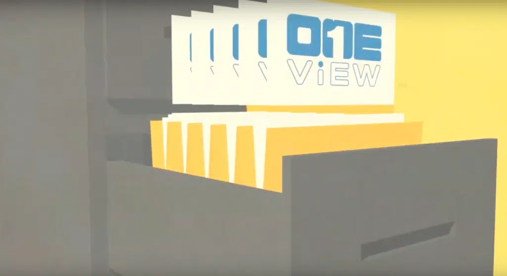
Yet, we use cabinets and drawers to depict storage and make something intangible, tangible. All the scenes happen around boxes or quadrilaterals that convey the ideas we want…so we have folders, cabinets, servers etc. The colours, look and feel of the 3D animation video could be summed up in one word — trendy. The illustrations were all smart. And to give it the perfect modern look, we would use flat colours.
The project was in Dinesh’s hands to do his magic. Now I’d told you this project was unique and given you the reason. But here’s another thing that made this video distinct—this video was done completely in 3D. Dinesh tried and innovated all types of fresh transitions that just left me stunned the first time I saw it. I’m told the video was 2D composited…I’d be damned if I tell you I know what it means! But I know one thing the end result was a 3D animation video that took your breath away!
