Last Updated on March 5, 2026
Contents
Can an explainer video become a Business Marketing Tool? Yes, if you have the right video, to begin with!
Marketing Message
WebEngage is a simple yet powerful in-site survey, feedback and notifications tool for e-commerce websites, that helps you collect useful marketing and sales insights. We had met the CEO, Avlesh, in person and so had a clear understanding of the product. He had run us through everything that WebEngage did and we were confident at the end of the discussion that we knew WebEngage like the back of our hand!
How we approached it
WebEngage is a huge product with endless features. It can help multiple industries and do numerous things. So the first and the biggest challenge was to condense it all and filter it into an under-2-minute video. We did this by conceptualizing a story that could explain all these vast problems through the medium of a few examples. Obviously, it was not possible and also not wise to include everything that WebEngage did, so we limited ourselves to the most important and relevant parts.
If this video were to be good as a Business Marketing Tool, we knew that the person involved would have to run a retail business, we thought of a lot of possible options before zeroing in on a flower business.

Style
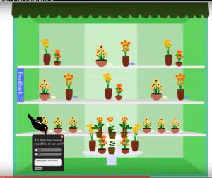
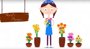
Nora was going to be the owner of a flower shop and this spoke of several “colorful” possibilities. We had decided long back that we were going to try a new route visually- we would be designing a website that looked like a store. Nora’s online shop would look like a regular shop and yet it would have the elements of a website. It would be a sort-of inter-marriage of reality and fiction. We were not going to use stick figures for these projects. The characters would look cartoonish and comical.

Colors
Flowershop….naturally this was going to be a colorful video. Live colors would enhance each scene and make them a work of art. We used flat, pale colors. We limited the use of warm colors and used more cool colors. Right from the first scene where the protagonist appears up to the last scene with all the characters, colors dominate the video.
Characters
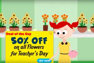
We have Nora and three customers, who play the main roles in the video. But apart from them we also have the folks who “build” the website – designer, IT guy and SEO specialist, and Jay’s wife. All the characters represented a wide spectrum of the human population and came from varying socio-economic backgrounds. And as we were not using stick figures, we could go into a lot of details to give the characters the right look. The expressions were key-frame based and the characters went from one expression to another without any intermediate steps. This made the video look comical in many places. This humor added entertainment factor to the Business Marketing Tool.

Visualization
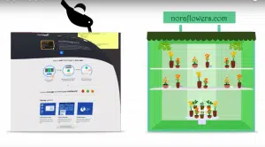
We already had a concept in mind and all the visuals were based on this. We also wanted the entire video to remind the viewer of the brand. So we used the brand mascot, crow, to bring in survey, feedback and notifications tools. Crow, which often transfers objects from place to place would be transferring codes to Nora’s website.
While we were aiming for a neat, uncluttered look, we didn’t want it to be too simple either. We went into a lot of details that a casual viewer might not have noticed. For instance, did you notice:
· The menu on the Restaurant board?
· Folks who build the website?
· The price tags attached to all the flower pots?
· A flower getting stuck to Nora’s head when all the flowers crash over her?
· The plant that Nora waters at the end is made of money?
· That Nora’s bandana and Drake’s shirt also have flower-based designs?
· That when Jay writes in a complaint he clicks the “attach screenshots” button and a screenshot gets attached?
· That the crow bringing in the feedback is wearing headphones?

Animation
Animations were aimed at complementing the story. This was done through a clear understanding of aesthetics and solid attention to the theme. So really interesting tit-bits have been added in places that delight the viewer. The logo reveal is one such example. It takes three simple arrows of the logo and turns it into something noticeable. The fumes when Nora smells the flowers immediately indicate the fragrance of the flowers. The wind that makes the flowers fall on Nora is a metaphor for how she is caught up in turmoil. The scene where Jay jumps out of the photo frame and lands on Nora’s website adds humor to the video. This scene also becomes funny because of his wife’s reaction and expressions. We used Adobe Illustrator and After Effects for this video.
With careful planning at each stage, a clear concept and visual ideas, this video became the love of our clients, kudos to the whole team!
So how was it used as a Business Marketing Tool? Well Not only did WebEngage have this video as the centerpiece of its website, but it also used the images and continuous the story in the website, thus giving a seamless story experience to the visitors to the site. They also used the video as a Business Marketing Tool in their interactions with their customers.
Team Involved
Creative Director: Anil
Script: Vimida
Animations: Saravanan
The success of this project has further solidified our reputation as a leading explainer video company in Bangalore, known for our creativity and attention to detail.
