Last Updated on March 6, 2026
Contents
If you have spent any time evaluating explainer video styles on SaaS websites recently you have probably noticed a pattern. The B2B SaaS market suffers from visual homogenization. Every second fintech startup seems to use the same shade of “trustworthy blue” and every B2B platform seems to use those same flat corporate characters with tiny heads and giant limbs. It is becoming a bit of a blur honestly.
However, when you are building a B2B brand standing out is not just a vanity metric. It is survival. You are likely competing with ten other solutions that do almost exactly what you do. Furthermore, your features and pricing are often similar. So how do you win? Differentiation relies on brand perception. You win by positioning your solution as the premium, innovative alternative to legacy competitors through distinct explainer video styles.
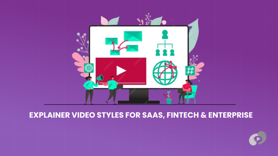
The Strategic Importance of Explainer Video Styles
The Power of Visual Language
The style of animation you choose is the first thing a prospect notices. Before they hear a single word of your script their brain has already made a judgment call based on the visuals.
The SaaS Challenge
You have to explain something invisible. Your product is just code. It lives in the cloud. How do you make code look attractive?
The Goal of This Guide
I want to walk you through the specific explainer video styles that are working right now for Enterprise SaaS and Fintech. To be clear, I don’t mean generic ‘cartoon’ styles. Instead, I mean the strategic visual languages that drive revenue and build authority.
TL;DR: A Menu of B2B Explainer Video Styles
- Isometric Animation: The gold standard for infrastructure and logistics. It gives a 3D feel to 2D assets and is perfect for showing “platforms” or multi step connections.
- Abstract UI (The “Fake” Interface): Instead of showing boring screen recordings we create stylized, simplified versions of your software. It focuses the eye on the value not the buttons.
- 3D Abstract Metaphor: The premium choice. Glass, light, and floating orbs. Great for cybersecurity and deep tech where you need to visualize “invisible” things like data encryption.
- Kinetic Typography: No characters. No scenes. Just bold, fast moving text. Perfect for “Manifesto” videos or hype reels at trade shows. For data-heavy messaging, kinetic typography ensures your key points are read even without sound.
- Frame-by-Frame (Cel): The artisan choice. Hand drawn animation that feels human and organic. A great way to stand out in a world of clean vector graphics.
1. Isometric Animation: The “Big Picture” View
We often recommend isometric projection for logistics clients who need to show complex networks clearly. You have definitely seen this style before even if you didn’t know what it was called. It looks like a 3D map but drawn in 2D. Everything is viewed from a diagonal top down angle.
Why is this so popular in B2B?
Visualizing Ecosystems
If you are selling a platform that connects different things, like a payment gateway that connects a shopper, a bank, and a merchant, isometric is the best way to show that. It allows us to create a “world.” We can show data packets traveling along little roads from one building to another. Consequently, it makes complex infrastructure look organized and manageable. (See how this applies to Fintech workflows).
The “God Mode” Perspective
Psychologically this angle puts the viewer in a position of control. They are looking down at the process.
For a CTO or an Operations Manager who feels overwhelmed by chaos seeing their workflow laid out in a clean, organized isometric grid is incredibly satisfying. It promises order.
When to Use It:
- You are selling logistics, cloud infrastructure, or API integrations.
- You need to show the relationship between multiple stakeholders.
- You want a clean, engineered look that feels precise.
2. Abstract UI: The “Future Proof” Solution
One of the biggest headaches for SaaS marketing teams is the UI update. You spend twenty thousand dollars on a video and three months later the product team changes the dashboard design. Now your video is obsolete.
This is where Abstract UI (or “Simplified UI”) saves the day.
Focus on the Function, Not the Pixels
Instead of recording your actual screen we draw a stylized version of it.
We remove the clutter. Next, we remove the specific dates. Finally, we strip away the boring navigation bars.
Therefore, we focus only on the action that matters.
If the feature is “One Click Approval” we just show a button turning green and a “Success” checkmark.
It Looks Cleaner
Real software interfaces are often messy. They have small text that is hard to read on a mobile screen.
Abstract UI allows us to make the text huge. Also, we can use bright colors. Finally, we can make the buttons bounce when clicked. It is a “hyper real” version of your product that looks better than the real thing.
When to Use It:
- Your product UI is still in beta or changes frequently.
- Your actual interface is text heavy and boring (like a spreadsheet or code editor).
- You want the viewer to understand the concept of the feature quickly.
3. 3D Abstract Metaphor: The “Enterprise Flex”
As we discussed in our 2D vs 3D Comparison, 3D is the heavy hitter. But for Fintech and Cybersecurity specifically there is a sub genre called “Abstract Tech 3D” that is dominating right now.
Think of those videos you see from companies like Stripe or IBM.
You see glowing orbs of light. Then, you see glass walls shifting. Moments later, you see golden coins flowing like liquid.
Visualizing the Invisible
How do you show “Encryption”? You can’t.
But in 3D we can show a glowing lock forming out of digital dust.
How do you show “AI Processing”?
We can show a stream of data points converging into a single beam of light.
The Premium Signal
This style screams money. It looks expensive because high end 3D rendering is expensive.
When an Enterprise buyer sees this they subconsciously categorize you as a “Tier 1” vendor. It builds trust. It says “We are sophisticated enough to handle your billion dollar business.”
When to Use It:
- You are selling high ticket enterprise security or AI solutions.
- You are targeting C-Suite executives who care about “Vision” and “Innovation.”
- You want to differentiate yourself from the flat 2D startup crowd.
4. Kinetic Typography: The Hype Builder
Sometimes you don’t need characters. You don’t need screenshots. Instead, you just need words.
Kinetic Typography is animation where the text is the main character. The words fly in, morph, explode, and dance to the beat of the music.
The Manifesto Video
This style is perfect for what we call a “Manifesto” video. This isn’t about features. It is about your mission.
“The Old Way is Broken.” [Text smashes screen]
“The Future is Here.” [Text glows]
It is high energy. It gets the blood pumping.
Trade Show Loops
If you have a booth at a conference you know it is loud. Nobody can hear your video.
Kinetic Type works perfectly without sound. The message is literally huge on the screen. You can’t miss it.
When to Use It:
- You are launching a new brand or category.
- You need a “hype” video for a conference opener.
- Your script is very powerful and punchy (short sentences work best).
5. Modern Outline / Thin Line: The “Architect” Look
This is a specific subset of 2D animation that is becoming very trendy in Fintech.
It uses very thin lines, lots of negative space (white background), and usually just one or two accent colors.
The Engineering Aesthetic
It looks like a blueprint or a schematic. It feels precise.
For B2B Fintech this is great because it implies accuracy. “We don’t mess around with your money. We are precise.”
Sophistication Over “Fun”
It avoids the “cartoon” feel. In fact, it feels mature. It is often paired with elegant serif fonts to give it a slightly editorial look, like something you would see in the New York Times or The Economist.
When to Use It:
- You are selling financial compliance, legal tech, or architectural software.
- You want to appeal to a very serious, professional audience.
- Your brand identity is minimalist.
6. The “Collage” or Mixed Media Style
This is for the rebels.
If you are a challenger brand trying to disrupt a boring industry this is your weapon.
Mixing Dimensions
This style mixes everything together. You might have a black and white photo of a person, but their head is an animated computer. You might have 3D objects floating over a 2D background.
Breaking the Fourth Wall
It feels chaotic but in a controlled, artistic way. However, it grabs attention because it breaks the rules of visual consistency. Ultimately, it feels raw and authentic.
When to Use It:
- You are targeting a creative audience (like marketing tools or design software).
- You are a “Disruptor” brand trying to look edgy.
- You want to stand out on social media feeds where everyone else is posting clean vectors.
7. Choosing the Right Colors for B2B
Our abstract styles rely heavily on color theory to evoke trust and authority. The style is one thing but the color palette is just as important. In the production process we spend a lot of time on this during the Style Frame phase.
The “Trust” Palette (Blue/Teal)
This is the default for Fintech. Blue lowers the heart rate. It signals stability.
But be careful. Because everyone uses it you might blend in. We often try to add a secondary “pop” color like a coral or a yellow to make it feel fresh.
The “Developer” Palette (Dark Mode)
If you are selling to developers (DevTools, APIs) go Dark Mode.
Developers stare at black screens with neon code all day.
Consequently, a video with a dark background and glowing neon accents feels native to them. It feels like “their” world.
The “Enterprise” Palette (White/Grey/Navy)
This is the safe zone. It is clean. Additionally, it prints well on a brochure. Consequently, it won’t offend anyone in the boardroom.
8. Matching Style to Lifecycle Stage
I think your company stage should also dictate your style choice.
Seed / Series A:
You need to explain what you do clearly.
- Go with: 2D Animation Isometric or Abstract UI.
- It is cost effective and focuses on clarity. (See our Pricing Guide).
Series B / Growth:
You need to show you are a serious player.
- Go with: 3D Abstract or High End Character Animation.
- Start investing in your brand perception.
Pre-IPO / Public:
You need to show vision and stability.
- Go with: Kinetic Typography (for vision) or Mixed Media (to show human impact).
9. Common Mistakes When Choosing Explainer Video Styles
I see these errors all the time in our Consultation Calls.
Copying the Market Leader
“We want a video that looks exactly like Salesforce.”
Why? They are already Salesforce. If you look like them you just look like a cheaper version of them.
Find your own visual lane.
Ignoring Your Brand Guidelines
You might fall in love with a premium 3D dark mode style. But if your website is bright white and pink the video will feel disconnected.
The video needs to feel like it belongs on your landing page.
Overcomplicating the Character Design
In B2B you don’t need characters with noses and toes and complex shading.
Simple is often better.
B2B characters are symbols of people not portraits. They represent the “User” or the “Manager.” Keep them stylized so the viewer focuses on the action not the fashion choices.
10. How We Help You Decide
When you work with us we don’t just ask “What do you like?”
We ask “Who are you trying to impress?”
During our pre-production phase we create mood boards. We pull references from inside and outside your industry.
For example, we might show you:
- “Here is a safe option.”
- “Here is a trendy option.”
- “Here is a wild card option.”
We discuss the pros and cons of each in terms of Budget and Timeline.
Remember a complex 3D style takes longer to render. If you need the video in three weeks we might steer you toward a sleek Motion Graphics style which is faster to produce but still looks premium.
Outcome
The style of your video is not just decoration. It is the dress code of your brand.
If you show up to a bank meeting in a clown suit you won’t get the loan.
Conversely, if you show up to a skater park in a three piece suit you won’t make friends.
You need to dress your video for the job it needs to do.
For SaaS and Fintech, that usually means balancing “Innovation” with “Trust.”
You want to look cutting edge but reliable.
You want to look expensive but accessible.
This is a fine line. However, when you hit it right, where the motion, the color, and the message align, it clicks. The viewer stops seeing “just another software video” and starts seeing the solution they have been looking for.
Let’s find the look that makes your product shine.

